-
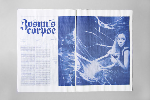
Fashion editorial work by Say What studio. As you can see a monotone print process has been utilised throughout the design work, applying it thoroughly across both type and image. More importantly it features an appropriate use of blackletter type. Relating it directly with photographs and concept behind them. Looking in the gothic and grotesque trend that has taken a leap over this year or so. Overall nice work indeed.
Design Context
Sunday, 9 December 2012
Duncan X
-
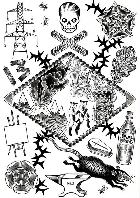
Found this guy through the book I bought earlier in the year 'Forever: The New Tattoo' and instantly felt amazed by his technique, and practice. He's not one of them boring tattoo artists, that regurgitates the same old stuff again and again. Instead he utilises his own style within his work, focussing on black and white, shading and line work. This allows a much more impressive overall outlook to his designs. A master craftsman.
Found this guy through the book I bought earlier in the year 'Forever: The New Tattoo' and instantly felt amazed by his technique, and practice. He's not one of them boring tattoo artists, that regurgitates the same old stuff again and again. Instead he utilises his own style within his work, focussing on black and white, shading and line work. This allows a much more impressive overall outlook to his designs. A master craftsman.
GIVE UP
-
This guys work speaks DIY all over, taking his artwork himself onto the streets, getting around and working hard to develop his skill set and passion. What I like the most about his work is the limited colour pallet in which he utilises across a broad range of products, creating a dark but direct relation to the audience it is designed for. Again someone who uses blackletter, what I think correctly. Using it within a context that dominates this as a significant element of design.
This guys work speaks DIY all over, taking his artwork himself onto the streets, getting around and working hard to develop his skill set and passion. What I like the most about his work is the limited colour pallet in which he utilises across a broad range of products, creating a dark but direct relation to the audience it is designed for. Again someone who uses blackletter, what I think correctly. Using it within a context that dominates this as a significant element of design.
Vberkvlt
-
Album artwork, layout and printing processes by Vberkvlt. What I particularly find appealing about his work is the morbid application in which he directly influences within his direction. Blackletter and visual logo work can be seen as a direct relation to the band and sub-culture revolving around his work. Images of demonic reference, associated with being evil is something that the sub-culture takes on board without any questions.
Album artwork, layout and printing processes by Vberkvlt. What I particularly find appealing about his work is the morbid application in which he directly influences within his direction. Blackletter and visual logo work can be seen as a direct relation to the band and sub-culture revolving around his work. Images of demonic reference, associated with being evil is something that the sub-culture takes on board without any questions.
NATVRES MORTES ILLVSTRATION
-
Automatically you know this guys work relates to all things evil, and everything supporting my metal & hardcore music. The sub-culture has been effectively sub-merged within his design work / illustration work. Utilising products within the context. Black and white is always effective when creating work for this type or music / people involved. Skulls can be seen across his work, an image of death consistently relating to the genre.
Automatically you know this guys work relates to all things evil, and everything supporting my metal & hardcore music. The sub-culture has been effectively sub-merged within his design work / illustration work. Utilising products within the context. Black and white is always effective when creating work for this type or music / people involved. Skulls can be seen across his work, an image of death consistently relating to the genre.
Tuesday, 20 November 2012
Face Candy - This Is Where We Were
-
ALBUM ARTWORK
ALBUM ARTWORK
TRACK LIST
1. Witness Intimidation (8:13)
2. Pill (5:06)
3. Life Jacket (2:03)
4. Infant (1:45)
5. Feeling Sprayed (2:53)
6. The Art of Faking Orgasm (3:02)
7. Buzz Kill (4:47)
8. Adult Toys (2:53)
9. Scream Therapy (1:51)
10. Braille (2:14)
11. Gun Powder (3:26)
12. Disappearing (3:01)
13. Pillow Bite (3:00)
LYRICS
-
Face Candy - Waste Age Teen Land
-
ALBUM ARTWORK
ALBUM ARTWORK
TRACK LIST
1. One (1:37)
2. Two (3:47)
3. Three (2:43)
4. Four (1:00)
5. Five (1:57)
6. Six (4:03)
7. Seven (1:25)
8. Eight (4:41)
9. Nine (2:15)
10. Ten (2:35)
11. Eleven (2:54)
12. Twelve (1:48)
13. Thirteen (3:27)
14. Fourteen (3:46)
15. Fifteen (3:24)
16. Outtake 5 Bonus Track (4:48)
LYRICS
-
Subscribe to:
Comments (Atom)


