Finally got round to finishing this manual off, deadline coming up and all. Realistically I would like to get this printed, as it would be more useful for myself to have it to flick through whenever I need to gather information. Overall I'm pretty happy with the processes I chose to include as they seem like the most appealing in terms of knowing the basics.
Showing posts with label OUGD201. Show all posts
Showing posts with label OUGD201. Show all posts
Sunday, 20 November 2011
Saturday, 19 November 2011
Design for Print ? LITTLE WHITE LIES
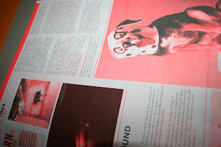
ANOTHER EARTH: This magazine looks incredible, especially the fact they have produced two copies each black and white, but reversed out oppositely to create a different flow through each one. By using no colour at all, allows the magazine to be printed cost effectively but also gives it subtly throughout the design.
Thursday, 17 November 2011
Design for Print ? - STOHEAD
SCREEN PRINTS - Although screen prints are widely used throughout the creative industry to produce artwork, there is something boldly interesting about this guys work. The fact he has created a graffitti stylised approach to his work, there is still that roughness and edge to his pieces. Nice stuff.
Wednesday, 16 November 2011
Good ? ARTICLE
I picked this 'zine' up a while ago and the main thing that wanted me to keep it was the spot colour, carefully placed in some parts of the content, which allows a slight but yet subtle change through the piece of design work. This has inspired me to try my own out.
-
-
Tuesday, 15 November 2011
Skateboarding Photos / Images
As I'm going to be using skateboarding images throughout my magazine including the cover and content, I have started collecting images that I feel are suitable enough, to create the most impact visually.
Monday, 14 November 2011
What is Design for Print ? Studio On Fire
Ahhhh, these are so nice. The new book produced by Studio On Fire to showcase their work. On the cover you can see a clear thought of printing process has been utilised. Using letterpress machines to print day-glo red on recycled board.
Sunday, 13 November 2011
Good ? Apparel: YASLY
Thanks to a link John sent us, I've came across these amazing pieces of Illustration. Purposely designed to be effective pieces of T-shirt design. Using a mixture of type and image brings the whole piece together creating a feel that keeps your eyes busy as you look at the piece of work.
Illustration in design.
What is Design for Print ? - Secret Chambers
Finishing : Leather engraving ? Now that's something I would have never expected to be used a piece of design work. It ties in nicely with the context on the image, focussing on egyptian pictograms relating to the culture appropriately.
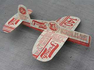
What is Design for Print ? - French Paper Flight Ephmera
Print for Finish: Promotion for a french paper company. Definitely has to be one of the most creative design pieces to successfully show the market, what that company can actually achieve, in terms of print processes. Again 2 colour plus stock seems to be the best match, allowing subtle changes hroughout the over laying imagery.
What is Design for Print ? - AIGA MN Design
Stock & finish - There is something gracefully colourful throughout these pieces of design. RGB ? A happy accident I think not. This has been superbly crafted to give a striking impact. Using a mixture of debossing and and colour, the pieces of design look stunning.
http://www.beastpieces.com/2011/10/aiga-mn-design-camp-materials/
What is Design for Print ? Wallpaper
Print for Colour - You can clearly see the thought that went into producing this piece of design work. Print processes have been executed with precision. The colour blend used to create the imagery on the cover gives a subtle gesture against the coloured stock. Allowing the design to run smoothly.
Wednesday, 9 November 2011
Skateboarding: Decks
STOP IT RIGHT NOW
These decks have been produced by Stop It Right to celebrate the iconic Celine print pieces from their French brands summer collection. The patterns themselves are intricate by also very minimal, taking elements from both ideas and interpreting them into one.
GREG HERVIEUX X ATELIER PALOMARES
Potentially one of the most expensive skate costing €1490. Wrapped in carfully placed gold leaf foil. Something only an expert could produce. Although this piece takes skateboarding out of it's true concept, it creates a new one showing the value of skateboarding as a whole.
SANTA CRUZ
Ahhhh, these are so nice. Such a great collaboration between Santa Cruz and Pabst Brewing company. This is what keeps the design flowing across skateboarding, collaborations take a massive impact in creating stylised pieces of hardware that you just want to own.
http://www.mfgbysc.com/pabst/
http://store.hufworldwide.com/
http://i-20.com/karen-heagle-2011/overview/
http://www.supremenewyork.com/
HUF AND HAZE
Again another sweet collaboration between the iconic styles of HUF as a brand, and the artwork of Eric Haze. Bold, primary colours, focussing on the old school look of the nineties. Nifty.
Again another sweet collaboration between the iconic styles of HUF as a brand, and the artwork of Eric Haze. Bold, primary colours, focussing on the old school look of the nineties. Nifty.
http://store.hufworldwide.com/
MAKE SKATEBOARDS
Custom made skateboards fitted to a gallery to create a exhibited skate shop. Where a number of artists will have the chance to produce there own work. Back to how you were greeted with artwork and not intense branding. Illustration put into practical use.
Custom made skateboards fitted to a gallery to create a exhibited skate shop. Where a number of artists will have the chance to produce there own work. Back to how you were greeted with artwork and not intense branding. Illustration put into practical use.
http://i-20.com/karen-heagle-2011/overview/
SASA OSTOJA AND BEN G
Collaboration between an artist from Amsterdam, with Ben G. The bold useage of vibrant colours throughout show a clear thought of how the deck can be brought to life without the need of a skateboarder itself. I enjoy this.
Collaboration between an artist from Amsterdam, with Ben G. The bold useage of vibrant colours throughout show a clear thought of how the deck can be brought to life without the need of a skateboarder itself. I enjoy this.
HARMONY SUPREME DECKS
'Harmony Korine is a Writer, Director, Filmmaker, and Artist whose work all has a distinct point of view that often highlights youth culture, dysfunctionality, mental disorders, poverty and other social ills. '
Collaborations are always creating that piece of iconic skateboarding design.
SUPREME 'SNOW WHITE' DECKS
http://www.supremenewyork.com/
DOODAH AND FREJA BEHA ERICHSEN
Models with skateboards ? Probably one of the coolest collaborations I have seen. Although they can be seen as mildly explicit. The image relates perfectly with the whole skateboarding concept. Showing youth culture with added sex appeal. Nice skate decks.
Subscribe to:
Posts (Atom)


