Showing posts with label OUGD104. Show all posts

Sunday, 24 April 2011

Facts on Sea Creatures.

Found a sick website about animals, species I didn't even know existed. Here are some of the facts I'm going to use in my posters.


http://www.arkive.org/


Great White Shark: 


KingdomAnimalia
PhylumChordata
ClassChondrichthyes
OrderLamniformes
FamilyLamnidae
GenusCarcharodon
SizeLength: up to 6.4 m
Weightup to 3,400 kg 

Flatback Sea Turtle:


KingdomAnimalia
PhylumChordata
ClassReptilia
OrderTestudines
FamilyCheloniidae
GenusNatator 
SizeAdult carapace length: c. 90 cm
Adult weight: c. 73 kg
Hatchling carapace length: c. 6.1 cm
Hatchling weight: c. 43 g 
Orca Whale


lso known as:killer whale
Synonyms:Orcinus glacialisOrcinus nanus


KingdomAnimalia
PhylumChordata
ClassMammalia
OrderCetartiodactyla
FamilyDelphinidae
GenusOrcinus 
SizeMale head-body length: up to 9.8 m
Female head-body length: up to 8.5 m
Newborn length: 2.1 - 2.4 m
Male weight: up to 9,000 kg
Female weight: up to 5,500 kg
Newborn weight: c. 180 kg 

Wednesday, 20 April 2011

Fish Anatomy.

Here are some examples of the anatomy and skeleton structure of fish I found on Google images. This has inspired me to try and incorporate something similar into my own project. As you can see it also focuses on the infographic side to the image and not just the line work.


Thursday, 7 April 2011

Victor Mathieux


Just had a quick browse on behance.net and found these posters designed around eating meals. The imagery is exactly what I'm looking for, using lines to create fish. Pretty lucky to come across these. I like the way illustration has been over layered onto a photo.


http://www.behance.net/gallery/Coasters-Posters-Lessons-Ive-learned-through-meals/1152583

Fishhhhhing Line.

Been thinking more about my direction for the 'What is a Line ?' brief. Instead of coming up with a totally made up concept consisting of illustration. I want to instead, explore a way to put my design work into a practice that already exists. Fishing seems to be an appropriate theme. There are hundreds of different lines that a fisherman could use to catch his fish. This is an image of a line that dissolves in water, creating an environmentally friendly method to fishing. Although you can't really see this directly from the image, I find it interesting as it is a jumble of shapes that create a nice photo. I'm going to start looking into this more.


Wednesday, 6 April 2011

Touché Amoré Flyers.

Just been looking at one of my favourite bands website and found these flyers that have been used to promote past gigs. I find the monochromatic layout of hardcore posters/flyers really appealing as it shows the simplicity of the message they aim to promote. Something I need to work towards in my own work.


Wednesday, 23 March 2011

Alex Young

Found an absolute sick artist on tumblr. Alex Young, his work is highly detailed and interesting. Definitely the sort of approach I want to take in my line project, focussing purely on illustration and different techniques of line.


Tuesday, 15 March 2011

Light Typography


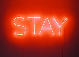
As I'm starting to look into typography that can be produced through a light source for the '' What is a line ? '' brief. I want to build up as much research as I can, looking at various different angles and media that create letterforms through the power of light and photography. 


Tuesday, 16 November 2010

Colour Wheel


This is an image representing colour in a circular spectrum. From the initial primary colours, you can see the secondary colours formed from mixing 2 of the corresponding colours. This can then be built into tertiary colours, surrounding the shape, which are formed from the same chromatic values.

Colour Theory - 2

Today we were looking at the chromatic values of colour in more depth. Our task was to select 3 of our collected objects and place them against various colours and shades. By doing this I was able to create an understanding of how colour can be effected by the foreground and background contrasts. If you get it wrong, the whole image will become useless.


I documented my processes of colour by taking photos. A lot of the pictures have either turned our dull or really vibrant. This is due to the fact a camera lens works in the same way as a human eye. Therefore when 2 complimentary colours are placed, there is an easy distinction between them. If a colour is placed in a background where it doesn't stand out enough, it will force it's complimentary colour, tricking your eye into believing it's there.