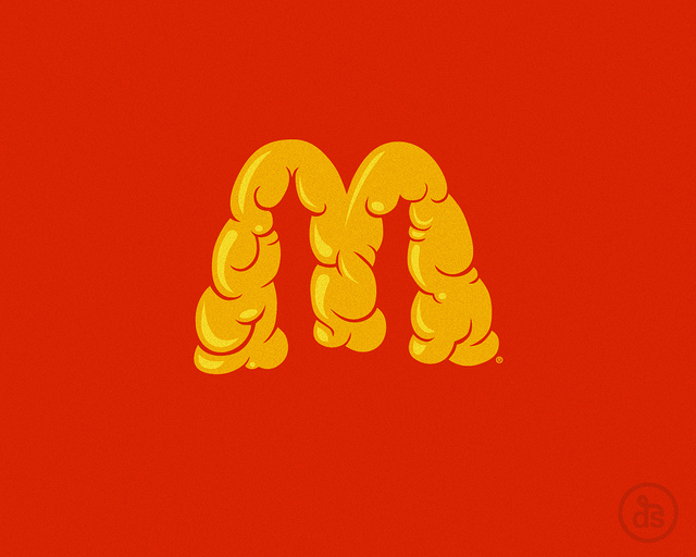
The bottom image of the improvised McDonalds logo is brilliant. It creates an ironic paradox of what the arches actually stand for and what consumers fail to see when you buy cheap fast food. He hasn't stuck to a normal A size stock either, which makes the designs all that more effective.


No comments:
Post a Comment