Enjoying these humorous card designs, purely typographic that put a message across effectively. The colours used subtly help the designs portray the aim of the effect. Overall nicely put together and I wouldn't mind having one of these sent to me.
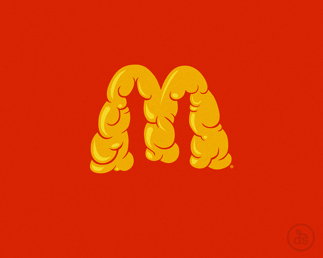
The bottom image of the improvised McDonalds logo is brilliant. It creates an ironic paradox of what the arches actually stand for and what consumers fail to see when you buy cheap fast food. He hasn't stuck to a normal A size stock either, which makes the designs all that more effective.
Hand-made letter-pressed posters creating an authentic, western styled, rustic look. The fact it's handmade makes it all that more crisp. The same effect could have easily been created on Illustrator, but It wouldn't have the same feel to it.
This has to be one of my favourite pieces of design work I have seen. The colours chosen work so well over layered together, creating a spectrum of vivid colours. You can clearly see a retro circus theme throughout with a conceptual modern outcome. Nice.
Type on a large scale. I think this is really effective in it's purpose, promoting local manufacturers and natural history. The letters can clearly be seen from a far, creating a bold, striking image for passers by. Might go check this out.
A C.V, book style. Pretty impressive practice of layout and calligraphic style type. Creative C.V's are the way forward. The fact it's been made to be opened and read like a book, will keep the viewer/reader continuously turning the page. Good design.
These are incredible. Putting good design tools into practice and producing stunning outcomes. Definitely something everyone should aim for. The fact these are laser etched makes them more crisp, rather than a plain printed vinyl.
Just been browsing on the Vans website. Came across this set of collaboration featuring Crooks & Castles design Mixed with Vans. Might have to buy these Tee's, they look fresh. Anyway the type fitst perfectly with each style of brand, incorporating the best aspects of each design.
Work done by a Norwegian design company called mission. I really like their work. They have a quality understanding to creating identities for companies. Keeping everything as simple but eye catching as possible.
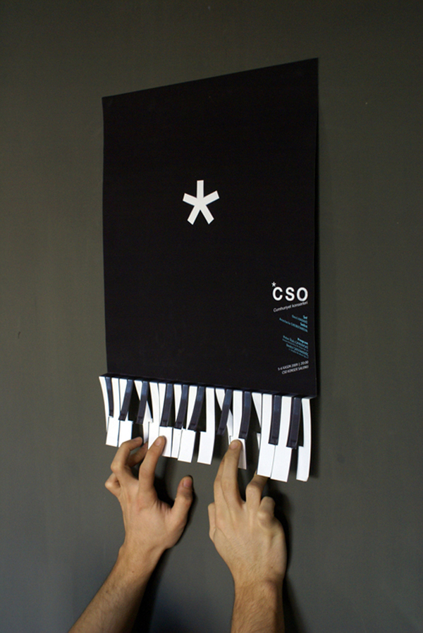
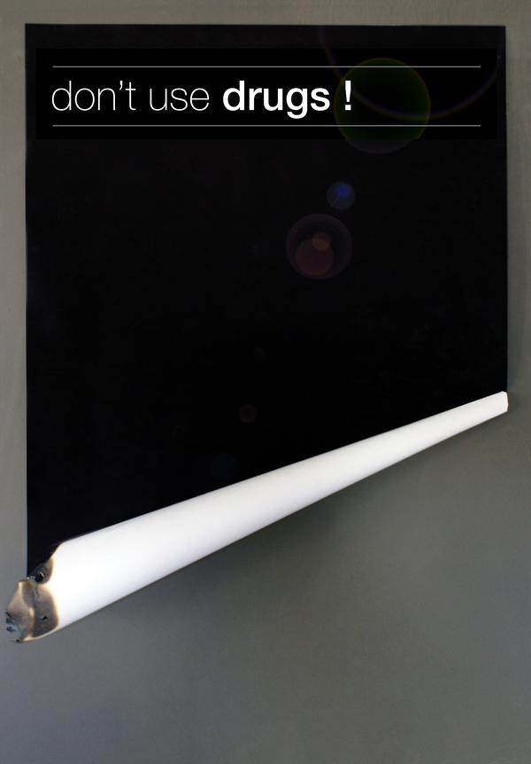
' I hate 2D Posters' speaks for itself really. This guy has produced a set of really effective posters that are 3 Dimensional giving you more interaction with each piece. Not everything print based has to be flat. I like that.
The main idea of this Typeface was to produce a set of letters, made out of fluent ribbon shapes. Overall I think they have done justice to their concept. Each letter flows nicely next to one another, creating an exiting space to read.
Bold typography, with a 3 colour pallet. Just my cup of tea really. The use of red seems to create a sense of subtle fear amongst the layout and typography. Although this is showing off a typeface, they haven't let that over run the design elements to each layout.
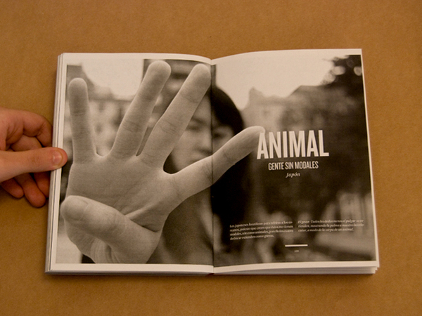
A lot of these images are from google and behance.net. But I have decided to pick layouts that are appealing to me and have unique qualities to each design. Using photography, image and type together effectively that would eventually solve a brief. This is going to help me massively during the InDesign workshop as I can now see what is already out there and be inspired in my own project.
Honestly, this is one of the most amazing videos I have ever seen. Visually, it's graphically stunning, using technology to it's full advantage. Creating a 3D simulation with intense darkness, scaring you, but at the same time keeping your eyes glued to the screen. Amazing.
An amazing colourful, interesting video, with well thought out layouts and concepts. By generating shapes that free fold into one another is something I particularly like when looking at design videos. It seems to break boundaries as to what a shape can be, therefore pushing design into a bigger practice.
Manchester based printing company calle 'Obscure Printing' the fact they deal with similar interests to me through music and design, makes their approach appealing. Pushing forward music in design.
A Swedish 'creative thinker' I like that title. It suitably matches his work as well. Everything has been thought out thoroughly and in the end, pieces of design are produce simply and effectively. It's not necessary to over complicate design to the masses, attention to detail and creatively excepted work can be far more appropriate.
I really like this guys work. Freshly graduated from University and he's already creating work to a professional standard. By keeping colours minimal and using photographs with over-layered shapes creates a much more established feel to his work. Now I know what I should be aiming for in my third year.